I’m Shawn, a data scientist working on disease prediction at BranchLab.
I’ve also joined Raghav Sehgal at the Hinda and Arthur Marcus Institute for Aging Research.
My research has included cancer cell differentiation in Columbia’s Azizi Lab and mosquito behavior in the Duvall Lab. At Colorado School of Mines, I supported Alzheimer’s disease research through SNP data extraction and cleaning and research code review.
I earned my M.S. in Data Science and B.S. in Quantitative Biosciences and Engineering at Mines. I also founded the BioBuilders Society and a biosciences outreach program, and taught students through CSM 101 and DECtech.
02 / MY WORK
My work
Research data, model outputs, and methods from the projects I’ve worked on. Select a measurement, gene, or model step to explore.
01 / BRANCHLAB
Disease modeling
01 / DISEASE MODELINGProject method
Disease prediction at BranchLab
At BranchLab, I build disease-prediction models using environmental and population data. One project used a normalized additive piecewise model for outbreaks.
My role: Data Scientist · June 2025–Present
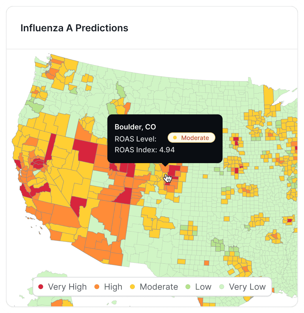
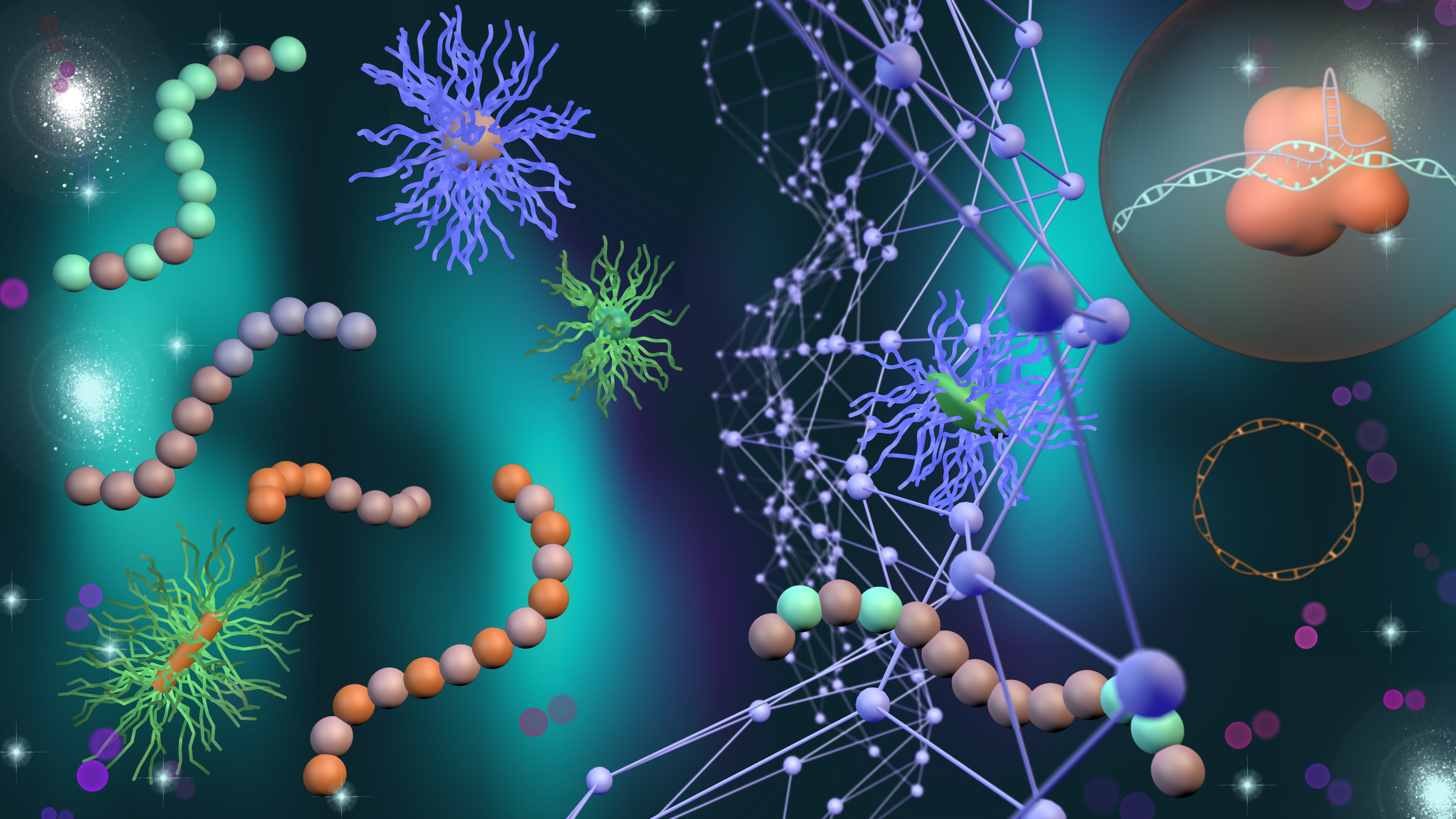
The fixed map is BranchLab’s original public graphic. The model diagram below describes the structure of my outbreak project.
Select a stage in the normalized additive piecewise model I worked on at BranchLab.
Signals
Viral load, population density, vaccination rates, and other environmental measures enter the model.
x = [viral load, density, vaccination, …]
Normalization
Inputs with different units are normalized before their contributions are combined.
x̃ⱼ = normalize(xⱼ)
Piecewise terms
Each input contributes through a piecewise function. The boundaries and coefficients belong to the fitted model.
fⱼ(x̃ⱼ) = contribution within the relevant interval
Additive output
The model combines the contributions. This diagram describes the structure; it does not substitute invented parameters for the production model.
ŷ = b + Σⱼ fⱼ(x̃ⱼ)
Project structure from my BranchLab experience. The original company map above remains fixed. BranchLab ↗
Lab references & project notes
02 / COLUMBIA UNIVERSITY
Azizi Lab & Duvall Lab
02 / AZIZI LAB · COMPUTATIONAL CANCER BIOLOGYLab work + model extension
Cancer cell states with Decipher
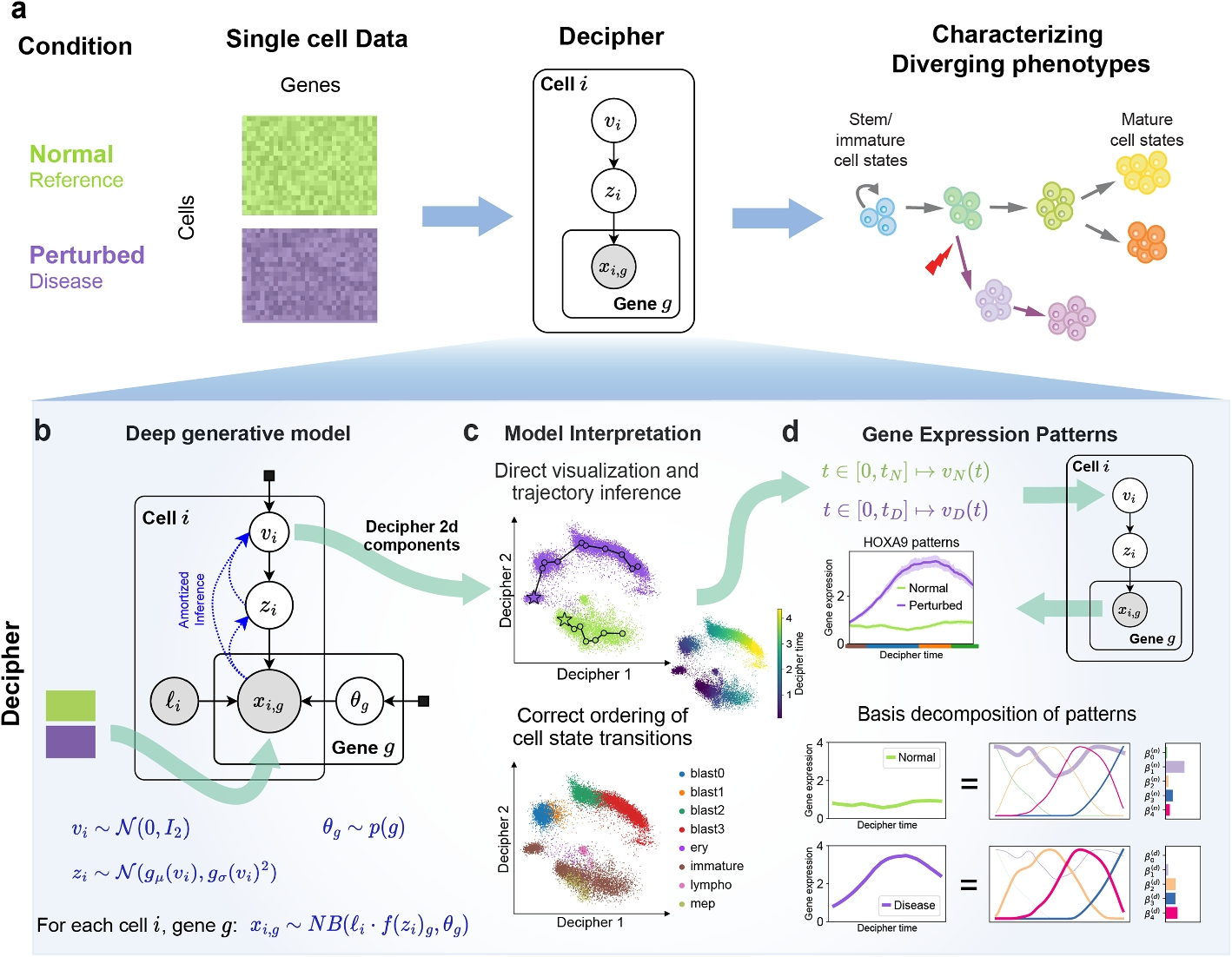
I worked on computational cancer research in the Azizi Lab, contributing to Decipher’s model architecture and visualizations of cell differentiation. My work included adding ATAC-seq information to a Decipher-based model. The walkthrough below follows that extension, with the published Figure 1 available for comparison.
My role: Machine Learning Cancer Researcher · March–December 2024
My extension adds chromatin accessibility to the RNA model. Follow paired measurements through the two observation models, inspect fitted cell states, and compare recovery with the RNA-only ablation. The plots use numerical outputs from my local simulation run.
This walkthrough explains the architecture. The trajectory evaluation below tests whether the fitted representations preserve biological structure, separately from these earlier signal-prediction plots.
Swipe diagrams sideways to see the full plot.
1 / 5 · Paired measurements enter the model
The two matrices describe the same simulated cells: RNA counts and binary ATAC accessibility. Selecting a row follows that cell through its latent state and feature profiles.
One selected cell connects the measurements, fitted coordinates, and feature profiles. All three models use the same cells and evaluation split.
aRNA and accessibility from the same cellsSynthetic benchmark · numerical model inputs
Cell 1 · training · 917 RNA counts across 56 genes · 32 of 120 peaks accessible. The tiles display a subset of features; the model uses all features.
bA shared state with two observation models
This is the generative direction. During inference, separate encoders combine RNA and ATAC evidence into z and infer v. RNA library size ℓ and gene dispersion θ enter the count model. This fit normalizes the RNA encoder input and uses 25% modality dropout during training. Cell 1 · posterior-mean z: [1.54, -3.46, -0.92, 1.13, -0.98, -0.77].
cThe learned state of each cell
Color follows the known simulated program. The ring locates the selected cell.
RNA + ATAC · cell 1 · v = [0.966, -0.867] · known program 0.840 · training cell. Positions come from this model run; no trajectory is fitted here.
dExpression and accessibility across the program
Cell 1 is in program bin 9/10 (28 cells). This cell: gene_0 = 35 raw counts; peak_0 = closed. Bin means: RNA 5.124; ATAC accessibility 50.0%. Profiles summarize the same observed inputs for both model configurations.
Observed inputs grouped by the known simulation variable: 10 bins × 28 cells. These are not decoder-generated trajectories or an inferred peak-to-gene link. Feature names are simulation labels.
eDid ATAC improve recovery of the hidden program?Same 56 untouched test cells
Adding ATAC raises test R² from 0.430 to 0.601 in this run. Cell 1: known program 0.538, Normalization + dropout linear readout 0.697. This cell is used for training or validation and does not contribute to the test score.
The RNA-only model is an ablation of my extension. This benchmark contains 280 simulated paired cells, with deliberately stronger program information in ATAC. It does not establish improvement in patient samples.
The input panel now includes paired RNA and ATAC. The generative model adds a Bernoulli peak decoder alongside the RNA negative-binomial decoder. Shared-state coordinates come from my re-executed extension, and the last panel evaluates its held-out recovery.
The original HOXA9 example and basis decomposition belong to the published RNA workflow. My current fork has not yet exported multimodal trajectory decoding or learned RNA/ATAC basis decompositions, so those results are only shown in the published-reference view. The profiles here summarize observed simulated inputs using their known program values.
The profile calculation first normalizes each cell’s selected RNA count as log(1 + 10,000 × count / library size), then averages within each equal-count program bin. ATAC is the fraction of cells with accessibility 1. Both feature views use the same cells in each bin. Each graph has its own units and no regulatory association is assumed.
My local RNA + ATAC fork · September 21, 2026 run · 56 genes, 120 peaks, 6 shared factors and a 2D state. All displayed cells, counts, accessibility calls and recovery scores come from the exported run. Run provenance ↗ Validation selects each checkpoint; the test partition is separate. Repeated ablations are shown below.
Published Figure 1 reference
1 / 5 · Start with measured single-cell RNA
Reference and perturbed samples enter as cell-by-gene count matrices. These tiles show eight measured genes for twelve example cells from each tutorial condition; HOXA9 is outlined because it is the gene followed in the published example.
aInputs and biological questionMeasured input · conceptual overview
Tile color shows per-gene log-normalized RNA expression; HOXA9 is outlined. The readout gives the original count.
The slider coordinates the redrawn panels by relative position. It is not inferred biological time.
bDeep generative model
Selected input: HOXA9 x = 0, library size ℓ = 8,212; stored v = (2.05, -0.76). Diagram only: no decoder is run here.
Method diagram + stored tutorial values
cPaths and cell states
ReferenceDisease
Markers follow the paths drawn in Figure 1c. The colored marks reproduce the printed cloud; they are not individual cell records.
Traced from the published figure
Inspect the actual cell annotations
blast0blast1blast2blast3eryimmaturelymphomep
Actual saved tutorial coordinates: 2,000 displayed cells, colored by source annotation. The ring marks the selected input cell. This is a separate view from the traced example above.
dGene-expression patterns
v(t) → z(t) → expected xg(t)
Figure position 35% · reference ≈0.72 · disease ≈2.65. Mean lines traced from the figure; uncertainty bands omitted.
With trained decoder weights, Decipher evaluates gene expression along the path—even between observed cells.
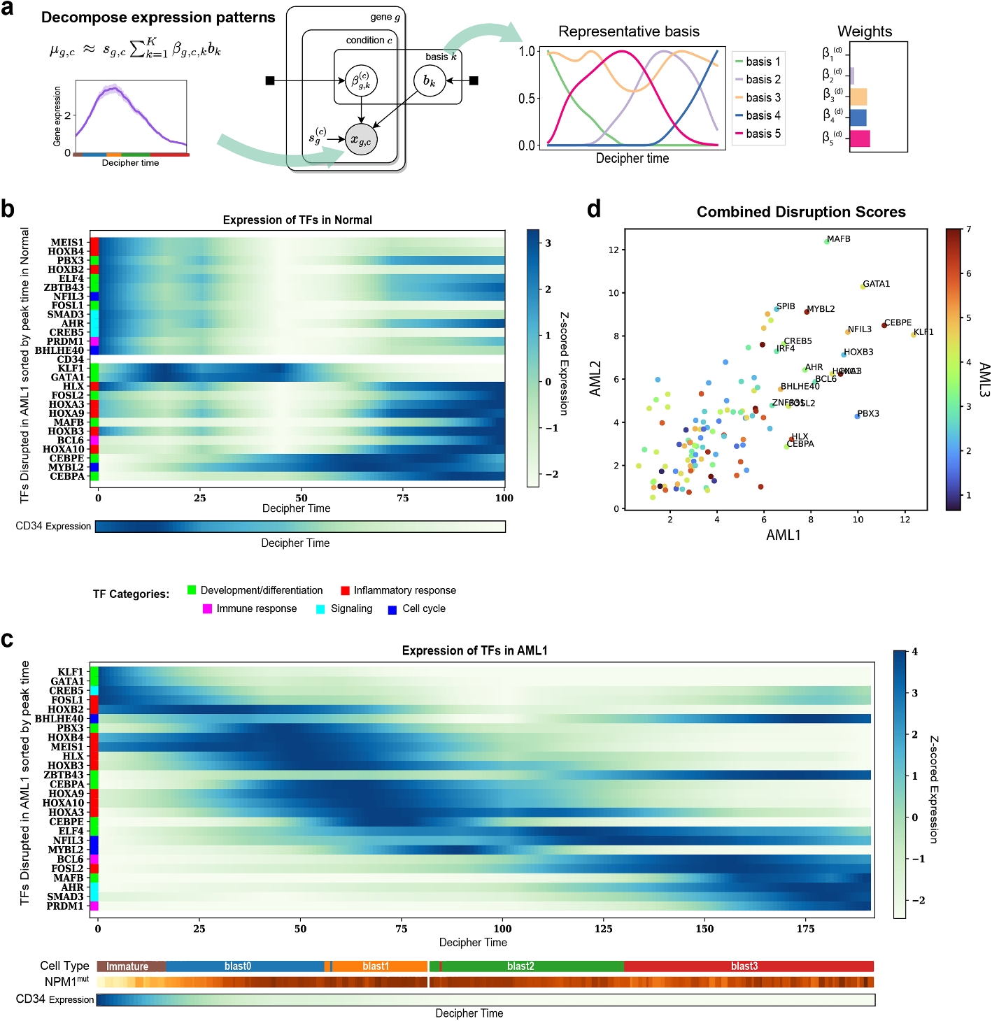
The same basis shapes can describe both conditions with different weights and expression scales. Toggle a component to see what it contributes to the reconstructed HOXA9 curve.
×→
Expressiong,c(t) ≈ sg,c ∑k βg,c,k bk(t)
Disease reconstruction: 5/5 components included. Solid = selected weighted sum; dashed = traced publication curve. Full-fit RMSE ≈0.095 figure units. Weights were refit to the traced artwork, not recovered from the trained Decipher model.
What is measured, traced, and reconstructed?
Measured / saved: the input matrices and selected-cell values come from the lab’s public tutorial dataset. The original cell inspectors below continue to use saved fitted coordinates.
Traced: the trajectory geometry, HOXA9 mean lines, and five basis shapes are digitized from the original Figure 1 artwork. They reproduce a published example, with graphical approximation. The scrubber uses relative position, not the paper’s shared arc-length Decipher time.
Reconstructed: nonnegative coefficients were refit to the traced curves to demonstrate the basis sum. They are not the paper’s posterior coefficients. No decoder, new biological trajectory, or clinical prediction is trained in this walkthrough.
In the actual method, shared basis functions are learned as neural networks, normalized to unit maximum; condition-specific β weights and scale s describe each gene pattern. The public tutorial file used here does not include the trained decoder checkpoint or trajectory/basis outputs.
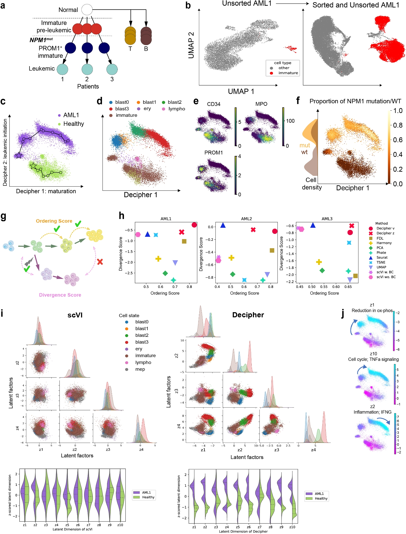
Predicting a signal is only part of the test. Here I compare cell ordering, branching geometry, and expression trends—the structure Decipher was designed to make interpretable.
Results depend on what is being measured. In the earlier-ATAC simulation, mean 2D geometry scores were 0.849 for RNA + ATAC, 0.789 for the RNA-only ablation, and 0.671 for the upstream architecture. Normalization + dropout scored 0.821. With uninformative ATAC, joint geometry fell to 0.836, below RNA-only at 0.879.
On the public A549 time course, ordering correlations were 0.031 for RNA + ATAC, 0.526 for the RNA-only ablation, and 0.425 for upstream Decipher. These tests do not establish a general improvement over Decipher or validated cancer-lineage recovery.
Swipe plots sideways to see every axis.
Reference and perturbed branches
Simulated paired RNA and ATAC measurements with a known shared starting state and a divergence at progression 0.40. Five scenarios test when accessibility helps, repeats RNA, carries no biological signal, or includes technical variation.
Known trajectory simulation ground truthRNA + ATAC · 2D
Teal: reference · Violet: perturbed. Lines show a training-fitted centroid tree; circles are held-out cells. Axes use each representation’s own scale.
Test cell 1 / 120 · Reference · true progression 0.381 · graph distance 2.133. Select a point or use the cell number control.
Global geometry (Kendall τ) · three independent runsExpression along progression synthetic branch marker · gene 1
Solid: noise-free expected expression. Dashed: native v → z → RNA decoder estimate. Test cells are grouped by their true time for this diagnostic; time does not enter the model.
Higher is better. Selected run: RNA + ATAC, 0.823. Small dots are individual runs; large dots and whiskers show means and 95% t intervals. Intervals are based on only three runs.
How these scores are measured
The geometry score uses the lab’s mean intercluster-distance Kendall metric. The clusters come from known simulated states for scoring only. Ordering uses a 15-neighbor graph fitted on training cells, with spanning-tree edges to connect gaps. Only immature training cells identify the root; test times never orient or fit the graph.
Branch-point location uses a separate 20-centroid spanning tree. It is an exploratory diagnostic, not proof of lineage topology. A missing non-root junction receives error 1. Early condition mixing should be near 0.5; late branch separation is measured after progression 0.70.
The common gene-trend comparison uses the same 15-neighbor RNA smoother for every method. A separate native-decoder score evaluates the Decipher mapping from v through z to RNA. MultiVI and linear baselines do not receive that score. Every model uses a fixed 120-epoch budget with validation checkpoint selection; settings were frozen before these tests. Three runs provide limited precision. Some validation-selected checkpoints reached the 120-epoch limit; this comparison does not establish convergence or a fully tuned ranking.
Selected metric · mean and 95% t interval across three runs
Model
Mean
95% interval
Upstream Decipher
0.671
0.587 to 0.755
RNA-only ablation
0.789
0.744 to 0.833
RNA + ATAC
0.849
0.792 to 0.907
Normalization + dropout
0.821
0.758 to 0.885
MultiVI
0.832
0.723 to 0.941
RNA PCA
0.691
0.675 to 0.706
ATAC LSI
0.712
0.675 to 0.749
A check against independently recorded time
Public sci-CAR measurements pair RNA and chromatin accessibility in A549 cells collected 0, 1, or 3 hours after dexamethasone treatment. Collection time was recorded by the experiment; it was not generated by this model.
RNA + ATAC · 2D · 660 test cellsAgreement with collection time signed Spearman correlation · higher is better
Teal: 0 hours · Coral: 1 hour · Violet: 3 hours. Each circle is a held-out cell.
Selected run: time correlation 0.087. Test cell 1: collected at 1 hours; inferred graph distance 0.542.
3,256 paired A549 cells passed coverage filters; 2,103 training and 660 held-out test cells. Each fit uses 600 RNA genes and 1,200 ATAC peaks selected on training cells.
These are public treatment-response data, not my Azizi Lab samples. Three collection times do not supply exact cellular pseudotime or establish branching cancer-lineage recovery. Repeated initializations measure optimization variation within one experiment, not biological replication.
Coverage, technical effects, and evaluation scope
RNA and ATAC barcodes must match, with consistent A549 treatment labels. Basic coverage filters require at least 100 RNA counts and 20 accessible peaks. Features are selected only on training cells. Barcode-prefix groups remain together across training, validation, and test partitions. These are technical groups, not patients.
The 0-hour training cells identify the root. No 1-hour or 3-hour labels fit the trajectory, and no held-out labels select settings or reverse the trajectory. Depth correlations below help reveal technical structure; they do not remove it.
2D ordering and absolute depth associations · means across initializations
This check uses the lab’s original simulator and geometry metric at five transition-sampling densities. It compares the upstream Decipher architecture with RNA PCA on held-out cells.
Adapted benchmark, not a reproduction of the published Figure 2 results: 1,000 cells, 50 genes, three dataset seeds, six latent dimensions, 120 epochs, and held-out scoring. The paper used a different training protocol and a broader method comparison. The simulator and scoring source are pinned to the lab repository.
These earlier plots test signal prediction, not trajectory accuracy. See the trajectory evaluation for ordering, branching, and real treatment-time comparisons.
MY DECIPHER EXTENSION / RNA + CHROMATIN ACCESSIBILITY
Compare the fitted cell states
Synthetic benchmark
My extension adds chromatin accessibility to a Decipher-based RNA model. Compare three fits on the same 280 simulated paired cells: RNA only, RNA + ATAC, and RNA + ATAC with normalization and modality dropout.
Here ATAC carries stronger information about the simulated program than RNA. These plots show actual fitted coordinates and test scores. The simulation does not establish improvement on patient data.
0.430RNA-only ablation · test R²0.601RNA + ATAC · test R²0.800Normalization + dropout · test R²
01 / WHAT I ADDED
Two observation models, one shared cell state
The diagrams explain the architecture. The comparisons use three separately trained fits.
Swipe diagrams sideways to inspect the full labels.
The extension adds an ATAC encoder and a Bernoulli peak decoder. A product of experts combines observed modalities into z. The guide uses z and encoder features to infer v. The paired benchmark also penalizes disagreement between RNA and ATAC encoders (weight 0.25).
02 / COMPARE THE SAME SIMULATED CELLS
Explore the learned representations
Select a point to follow the same cell across all three maps. Each fit has independent latent axes; movement between maps is not a biological trajectory.
The RNA-only ablation removes ATAC from the same experimental architecture. The study below also includes an independent fit of the original Decipher model.
03 / QUANTIFY THE DIFFERENCE
Measure recovery of the hidden program
A linear readout maps the two latent coordinates to the known simulated program. The default readout is fitted on the 182 training cells and scored on the same 56 test cells for all three models.
Linear readout fitted on 182 training cells; R² evaluated on 56 test cells.
RNA-only ablation: 0.430 · RNA + ATAC: 0.601 · Normalization + dropout: 0.800. Linear readout fitted on 182 training cells; R² evaluated on 56 test cells.
Read the exact comparisons and evaluation protocol
New simulation run · September 21, 2026
Metric
RNA-only ablation
RNA + ATAC
Normalization + dropout
Direction
Test program recovery
0.429525
0.600578
0.800102
Higher is better
Test program error
0.655020
0.518276
0.358758
Lower is better
Test RNA count error
4.834499
4.989390
4.985277
Lower is better
All-cell program recovery
0.319203
0.492884
0.848548
Higher is better
This view uses the first prespecified fresh evaluation pair: data seed 201 and model seed 41. Each fit uses 182 training, 42 validation, and 56 test cells. The linear readout is fitted on training cells only.
The detailed maps use the first prespecified fresh evaluation run (data seed 201, model seed 41). Broader comparisons below use three seed pairs and six signal settings. Earlier experiments are retained separately.
The original saved summary used an all-cell readout. Current test metrics restrict scoring to the test partition. The optional all-cell view is descriptive and is not a generalization result.
04 / INSPECT OPTIMIZATION
Follow the training and validation losses
Normalization + dropout · epoch 80/80 · train objective 206.869 per cell · validation objective 242.128 per cell. Returned checkpoint: epoch 80, selected by validation. These are objective values, not accuracy scores.
Observation terms and training-time masks differ across configurations. Compare training with validation within a model; lower raw loss across models does not establish better performance.
Model runs from my experimental Decipher extension. Run provenance. Fresh robustness tests and a separate public paired-data comparison follow. The published Figure 1 remains available in the walkthrough’s reference view.
TESTING THE EXTENSION
Which changes help—and where?
Synthetic benchmark
I tested RNA normalization and modality dropout separately, then compared what the model retains in its 2D display and its six latent factors. Each comparison below uses three fresh simulation runs with the same training, validation, and test splits across methods.
Swipe a plot to see its full width.
Separate the two changes
Same architecture and objective weights; change only normalization and dropout.
Compare stronger baselines
Independent original Decipher fit, single-assay controls, and the normalization/dropout extension.
2D v readout: standard RNA + ATAC 0.683; normalization + dropout 0.725 test R² (+0.042 points). For normalization + dropout, the 6D representation scores 0.828 versus 0.725 in its 2D display. Each value is a mean across three fresh runs.
Normalization
Library-size normalization changes the RNA encoder’s input. The count decoder still models raw RNA counts.
Modality dropout
During training, some paired cells temporarily provide only RNA or only ATAC. This tests how the representation handles missing evidence.
The 2D bottleneck
The same trained model can retain information in six factors that is harder to recover from its 2D display. PCA of those factors provides a second 2D comparison.
View modality-weight selection and full results
Six weight combinations were compared on validation data from separate development simulations. The selected weights were frozen before generating the fresh evaluation runs shown above. The search considered both RNA-favored and ATAC-favored signals.
The search selected ATAC weight 1 and alignment weight 0.25, with normalization and 25% modality dropout. Those match the normalization/dropout configuration above. Increasing ATAC weight to 4 did not win the validation comparison.
Test R² · mean and 95% Student-t interval across three matched simulation runs
Model
2D v
6D z
2D PCA of z
RNA-only ablation
0.429 [0.426, 0.431]
0.442 [0.412, 0.471]
0.432 [0.416, 0.447]
ATAC-only ablation
0.867 [0.783, 0.951]
0.875 [0.793, 0.956]
0.872 [0.784, 0.960]
RNA + ATAC
0.683 [0.332, 1.033]
0.788 [0.572, 1.004]
0.750 [0.425, 1.075]
Normalization only
0.636 [0.124, 1.147]
0.763 [0.476, 1.050]
0.752 [0.420, 1.084]
Dropout only
0.677 [0.268, 1.085]
0.809 [0.668, 0.950]
0.786 [0.587, 0.985]
Normalization + dropout
0.725 [0.273, 1.176]
0.828 [0.710, 0.946]
0.832 [0.712, 0.951]
Validation-selected
0.725 [0.273, 1.176]
0.828 [0.710, 0.946]
0.832 [0.712, 0.951]
Original Decipher
0.433 [0.424, 0.442]
0.432 [0.314, 0.550]
0.429 [0.397, 0.461]
RNA PCA · 2D
0.422 [0.402, 0.442]
—
—
ATAC LSI · 2D
0.886 [0.824, 0.949]
—
—
Dots show individual runs; bars show their mean. The intervals describe variation across three dataset/model seed pairs. They are exploratory and do not measure uncertainty across patients. Original Decipher keeps its upstream architecture; equal epoch budgets do not imply equal parameter counts or compute. PCA and LSI use two components and appear in the 2D comparison only.
Completed model runs from my experimental Decipher extension. Data and run provenance. Simulated programs test model behavior; they are not measured cancer phenotypes.
PAIRED RNA + ATAC / PUBLIC DATA
A real-data comparison with MultiVI
Measured PBMC data
MultiVI was a direction I considered during my research on combining RNA and chromatin accessibility. Here, I compare the published method with my Decipher extension using public, paired measurements from the same cells.
The 10x Genomics dataset contains 2,711 PBMC nuclei from one healthy donor. The benchmark uses 1,000 genes and 2,000 peaks selected on training cells. It tests technical transfer between assays, not cancer progression or performance on new patients.
Predict log1p expression normalized to 10,000 counts within the selected gene panel. Lower error is better.
Swipe a plot to see its full width.
RNA + ATAC: 1.2112 · Normalization + dropout: 1.1758 · MultiVI: 1.1264 · PCA / LSI: 1.2337 · Promoter activity: 1.1907 · Training mean: 1.2341. Neural dots show three initializations on the same cell split; baselines are deterministic. These are cross-assay readout results, not native decoder scores.
EXPLORE THE HELD-OUT CELLS
Observed expression and cross-assay predictions
The map projects joint latent factors into two dimensions using PCA fitted on training cells. The second plot tests a different task: predict RNA from ATAC alone. Select a cell to connect its position, measured expression, and prediction.
Test cell 1 of 542 · NKG7 observed 0.000; predicted from ATAC 0.603 · 1375 accessible peaks in the selected panel. Normalization + dropout, first prespecified initialization. The map uses both assays; the prediction uses ATAC alone. Axes are fitted independently for each model.
Methods, regulatory links, and interpretation
All methods use the same cells, feature panel, and train/validation/test split. The neural comparison uses three initialization seeds and an 80-epoch budget, restoring the lowest validation objective. Cross-assay prediction uses the same ridge-readout procedure on six-dimensional assay representations; the hidden assay is zeroed before inference. Readouts fit training cells only and select regularization on validation cells. These are readout benchmarks, not a comparison of native decoder likelihoods.
The selected feature panel contains 245 promoter–gene annotations. I used these links in the promoter-activity comparison instead of assuming RNA and ATAC align simply because their latent dimensions match.
Promoter activity uses the dataset’s genomic annotations to connect selected peaks to genes, then compresses activity to six training-fitted principal components. This is a proximity-based baseline, not proof of regulation. The PCA/LSI baseline uses six components per assay. Matching scores evaluate whether RNA and ATAC representations retrieve the same held-out barcode; no cell-type labels are inferred.
MultiVI: Ashuach et al., Nature Methods (2023), implemented with scvi-tools 1.4.3. For separate RNA and ATAC libraries, GLUE provides a published example of regulatory-graph guidance. This benchmark evaluates paired data and a promoter-activity baseline; it does not establish alignment of unpaired cancer libraries.
Public PBMC test results · means across three neural initializations; deterministic baselines run once
Earlier robustness controls: shuffled ATAC, feature balance, and checkpoint selection
DECIPHER / TESTS + ABLATIONS
Testing what ATAC adds
Synthetic benchmark · September 21
These experiments test the extension across complementary signals, RNA-dominant signals, a null program, sparse ATAC, variable depth, and missing modalities. Each setting has three matched dataset/model seed pairs. Every fit uses 182 training cells, 42 validation cells for checkpoint selection, and 56 test cells that stay out of fitting and selection.
Complementary ATAC · Joint · alignment 0.25: mean test R² 0.508, across 3 seed pairs. Paired change versus RNA only: +0.164; 95% interval [-0.076, 0.404].
Test recovery across repeated fits
Dots are individual runs; the diamond is their mean. Whiskers show an exploratory 95% Student-t interval across three seed pairs. Wide intervals reflect limited replication. Negative R² means the readout is worse than predicting the test-set mean.
Inspect the 56 test predictions
Joint · alignment 0.25 · data seed 42, model seed 19 · test R² 0.533 · MAE 0.503. Returned epoch 77/80. Dashed line: perfect recovery.
What changed in the code
Separate test data. Patient partitions are frozen before selecting ATAC peaks. Feature selection and linear readouts use training rows only.
Recoverable fits. Checkpoints save neural weights, RNA dispersion, feature names, splits, and histories. Validation selects a checkpoint; test scores do not.
Experimental options. RNA input normalization, modality dropout, and per-feature loss scaling are tested as separate configurations. They are not assumed to help.
Controls. ATAC-only, no-alignment, shuffled-pairing, final-epoch, RNA PCA, and ATAC LSI comparisons test alternative explanations. Shuffling stays within each partition.
Across simulation settings
Mean test R² over three seed pairs. Select a tile to inspect that setting and configuration. Blank cells mean that configuration was not run for the missing-modality design.
Exact scores, evaluation protocol, and limits
Selected setting · mean and 95% interval over seed pairs
Configuration
Mean test R²
95% interval
Paired change vs RNA
RNA only
0.343849
0.297861 to 0.389837
0.000000
ATAC only
0.896369
0.860220 to 0.932518
0.552520
Joint · no alignment
0.674776
0.078779 to 1.270773
0.330927
Joint · alignment 0.25
0.508180
0.284812 to 0.731549
0.164331
Shuffled ATAC
0.305923
0.230652 to 0.381194
-0.037926
Per-feature scaling
0.101132
-0.107770 to 0.310034
-0.242717
Normalized RNA + dropout
0.822655
0.503979 to 1.141331
0.478806
Joint · final epoch
0.534501
0.260579 to 0.808424
0.190652
RNA PCA
0.325290
0.307263 to 0.343317
-0.018559
ATAC LSI
0.890088
0.869381 to 0.910795
0.546239
Each neural model has an 80-epoch budget. The final-epoch control returns epoch 80; other neural models restore the lowest validation objective. The linear readout is fitted on training coordinates only. PCA components and LSI inverse-document frequencies are also fitted on training cells only. All methods use two readout coordinates.
These are exploratory synthetic comparisons, with three matched seed pairs and no multiple-comparison correction. The RNA-dominant and null settings test whether the gains depend on the simulated signal. The missing-modality setting retains valid single-modality cells; single-modality baselines and shuffled pairing are omitted there. Normalization plus dropout is a combined intervention, so this grid does not separate their individual effects.
Independent upstream Decipher, MultiVI/GLUE, patient-level outcomes, and biological trajectory validation remain future comparisons. The current tests do not establish improved cancer prediction or valid alignment of unpaired patient libraries.
Numerical outputs from run_ablation_benchmark.py in my experimental fork. Code and run provenance ↗. Each point is an executed model or baseline result; no paper image was used to generate these values.
Explore cancer cell states and marker genes
Saved model output
These views use the Azizi Lab’s saved Decipher coordinates and measured RNA counts. Compare marker genes, inspect individual cells, or read expression across cell populations.
DECIPHER TUTORIAL / COORDINATED FEATURE MAPS
Gene expression on the Decipher map
The lab’s tutorial plots these six genes in a three-column layout. Here, selecting a cell marks it in every panel so you can compare its measured expression.
2,000 cells per map; a fixed 2,000-cell subset before filtering (every ninth source row). Each gene has its own 99th-percentile color limit, held fixed across conditions. All maps share the same axes; rings identify the same cell.
6,000 cells visible from a fixed 6,000-cell display sample of 18,000 source cells. Colors use the source cell-type annotations.
Enlarge, then swipe to inspect.
Swipe when enlarged. Fit for an overview.
AML1 · blast0 · source row 1. Select a factor bar or choose a latent factor under Color by to locate its values on the cell map. The axis fits this cell’s factor range.
The profile summarizes all 18,000 source cells. The scatterplot shows every third row (6,000 cells); filtering does not retrain or move the model.
AML1 is the tutorial’s cancer sample. Latent z factors are learned coordinates, not named pathways or gene-expression values.
Select a dot, or use the cell slider with arrow keys.
AML1 · blast0
v₁ -1.6208 · v₂ -0.1666 · source row 1
AVP
0 counts
MPO
0 counts
CD68
0 counts
HOXA9
0 counts
CD34
0 counts
LYZ
2 counts
NPM1
25 counts
PROM1
2 counts
RNA EXPRESSION / ALL 18,000 CELLS
Marker expression across populations
A standard single-cell dot plot: dot area shows the fraction of cells with detected RNA; color shows mean expression. Switch to the heatmap for numeric tiles. Both summaries use every source cell.
Swipe when enlarged. Fit for an overview.
Both conditions · blast0 · AVP: 0.064 mean log1p normalized counts. n = 2,701. Detected in 4.4% of cells.
Summaries use every source cell. Colors stay fixed across conditions. Missing groups appear as × in the dot plot or hatched heatmap tiles. RNA detection also depends on sequencing depth.
Decipher’s generative hierarchy maps a two-dimensional state v through higher-dimensional factors z to gene counts x, using a negative-binomial count likelihood. Both v and the ten z factors shown here come directly from the saved tutorial model. Factor colors use a zero-centered scale clipped at the 99th percentile of absolute values for that factor; the inspector retains the unclipped values. The website does not refit the model.
Gene colors use log1p(10,000 × gene count / total counts across the 3,130 provided genes), clipped at the full dataset’s 99th percentile for each gene. The inspector shows the original counts. Expression profiles are means of the same normalized values, grouped by source annotations. No cell barcodes or mutation metadata are displayed.
03 / DUVALL LAB · MOSQUITO NEUROBIOLOGYPublished data
Mosquito neurobiology
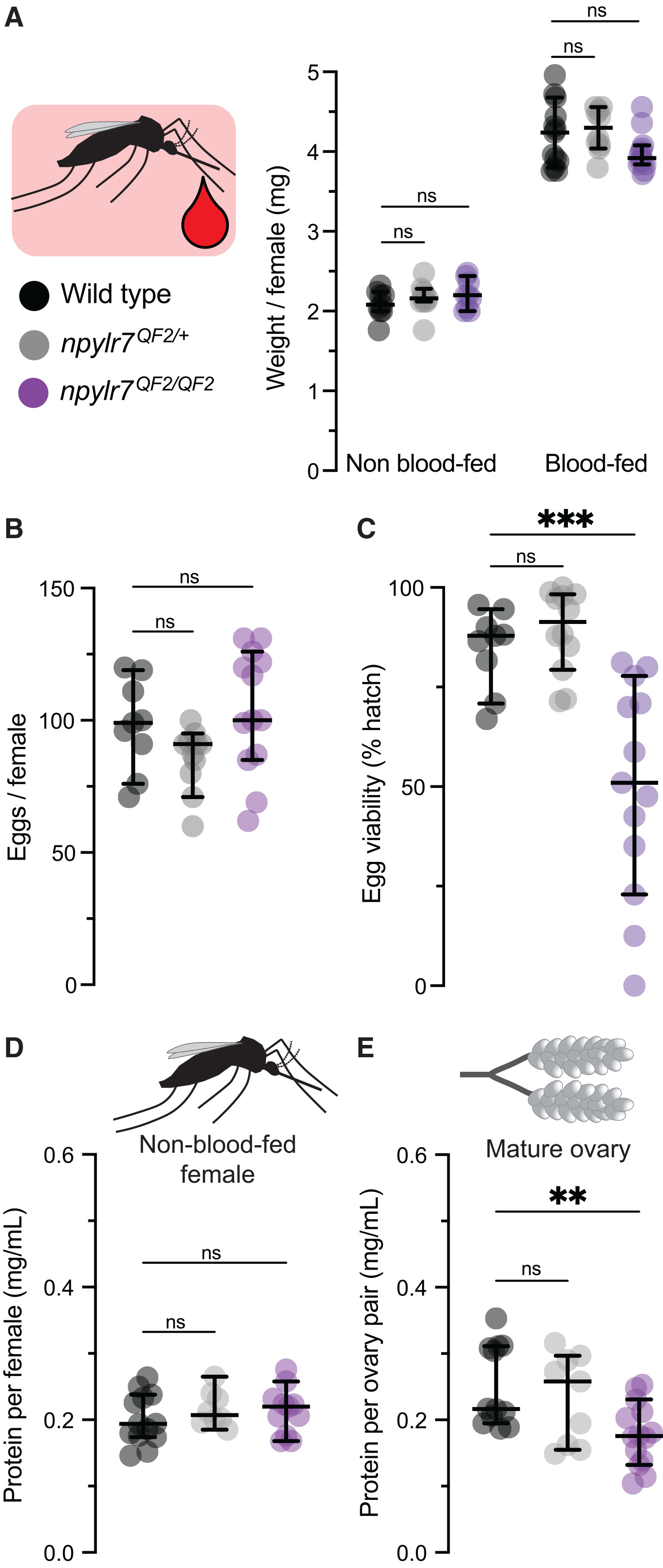
In the Duvall Lab, I developed an assay to study Aedes aegypti biology. Figure 2 in this study connects NPYLR7 loss to egg provisioning and hatch rate.
My role: Mosquito Neurobiology Amgen Scholar · May–August 2023
NPYLR7, egg provisioning, and hatch rate
Published measurements
Figure 2 from the Duvall Lab study I worked on. Each point below comes directly from the paper’s source-data workbook. Switch measurements to compare body mass, eggs, hatch rates, and protein content.
The original figure shows medians and 95% confidence intervals. This redraw shows the individual source values and medians; it does not reconstruct those intervals. Adjusted P values are copied from Data S1, sheet A, rather than recalculated when a group is highlighted.
Sample sizes count the numeric entries in the workbook. Some workbook n labels differ from their filled rows. The caption and workbook also differ in the named tests for panels A and C; the displayed P values follow the workbook. Every measurement remains traceable to its source cell.
Greppi, Frank, Saltz & Duvall (2026), Current Biology · Figure 2 and Data S1, sheet A ↗. Original figure retained with author attribution. My connection to this figure is from my work in the Duvall Lab.
Original Figure 2 & paperView full size ↗Figure 2 · Greppi, Frank, Saltz & Duvall (2026). Unmodified publisher figure. Original paper ↗
I supported Alzheimer’s disease research in Hua Wang’s lab by extracting and cleaning SNP (single nucleotide polymorphism) data and helping review research code.
My role: Machine Learning Neuroinformatics Researcher · May–September 2022
WHERE I CONTRIBUTED
01 / Data extraction02 / SNP data cleaning03 / Code review
The interactive models below explain related research from the lab. Their methods and reported results belong to the paper’s authors; they describe the research context for my supporting role.
RELATED LAB RESEARCH / IMAGING + GENETICS
From repeated scans to memory predictions
Research context
Follow how a longitudinal model brings MRI measurements, genetic variants, and observed cognitive scores into a shared representation. Then compare the published prediction errors and inspect the features the model weighted.
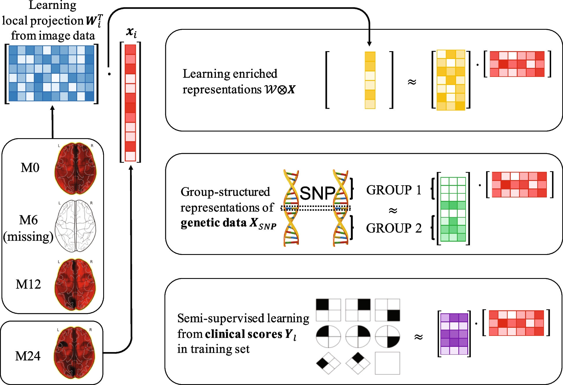
Based on Seo, Brand & Wang (2024), related work from Hua Wang’s lab; not a confirmed publication of my 2022 project. My lab contribution focused on SNP data preparation and code review.
01 / Keep the available visits
The method learns from each participant’s available imaging records, even when record counts differ. The timeline is a schematic; it contains no participant measurements.
Swipe diagrams sideways to see the full plot.
a
Repeated visits → one representation
Method diagram · Figure 1
Last observed visit: 12 months. Earlier records help learn Wᵢ; the last record xᵢ is projected to zᵢ. The dimension of zᵢ stays fixed. This switch does not simulate an MRI or alter the published benchmark.
b
Couple imaging, genetics, and labels
Model structure · Figure 2
Shared participant factors connect static genetics, enriched imaging, and available clinical scores. Matching purple columns indicate the same participants, not fitted numbers.
WHAT DOES THE MODEL WEIGHT?
Inspect both sides of the representation
Imaging weights locate selected brain regions. Genetic weights can be inspected as individual variants or groups of variants.
Four regions identified for each MRI representation
FS · Right caudate
FS · Brodmann area 24
FS · Left thalamus
FS · Left caudate
VBM · Left hippocampus
VBM · Left amygdala
VBM · Left thalamus
VBM · Right medial orbitofrontal cortex
FS and VBM are two ways to extract measurements from MRI. This is the paper’s weight map; numeric region weights are not supplied here. Weight is not a measure of tissue damage.
d
Variants → gene groups
Published weights · Figures 5 & 6
rs10779339 → CR1: individual weight ≈ 0.1195. The CR1 group mean is ≈ 0.0939 across 15 SNPs. These are different summaries of the same feature set.
Links show group membership, not biological interactions. Only the ten displayed SNPs from Figure 5 appear here. Group means in Figure 6 include additional variants.
DOES ENRICHMENT HELP? / PUBLISHED FIGURE 3
Compare the same model across input combinations
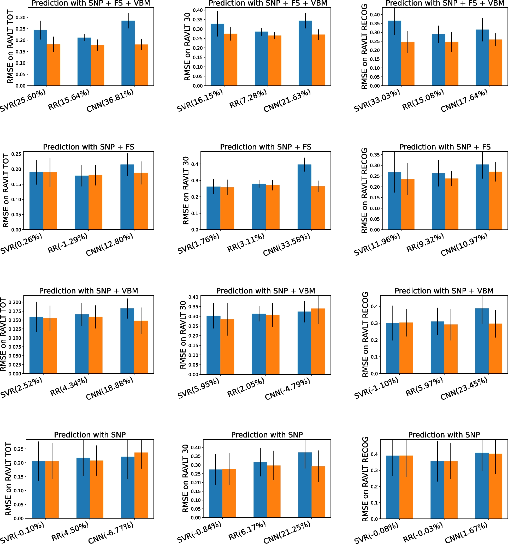
Each pair compares original and enriched features. Left is lower prediction error. Change the regressor, then select an input combination to follow it across three memory-test outcomes.
Original featuresEnriched features↑ Error increased
Swipe diagrams sideways to see the full plot.
SVR · SNP + FS + VBM · RAVLT total: original RMSE ≈ 0.244 → enriched RMSE ≈ 0.182. The paper reports 25.60% lower error.
RMSE means root mean squared error. Values and SDs are approximately digitized from Figure 3; percentage changes use the paper’s printed labels. Each panel uses a zero-based RMSE axis. The missing-visit diagram above does not change these published results or run a model.
Read the values in a table
Published comparisons for support vector regression
Inspect the genetic feature weights and prediction comparisons published by Seo, Brand & Wang (2024), from Hua Wang’s lab. These are interactive redraws of the paper’s results.
PUBLISHED FIGURES 5 & 6 / FEATURE WEIGHTS
From gene groups to individual variants
The paper ranks genetic features by learned model weight. Select a group to locate its variants in the displayed SNP ranking.
Swipe when enlarged. Fit for an overview.
Swipe when enlarged. Fit for an overview.
Select a gene group to link the two rankings. The paper displays ten SNPs: nine in ACE and one in CR1. Whiskers show variation among SNP weights within each gene group.
Weights and standard deviations are approximate, digitized from the original vector figures. Colors follow the paper’s gene groups. Whiskers show variation among SNP weights within a group—not confidence intervals or variability across validation folds. These are model weights, not association P values or clinical risk scores.
Numeric values and source details
Approximate weights digitized from Figures 5 and 6
Feature
Type / group
Weight ≈
SD ≈
SNP count
ACE
AlzGene group
0.09875
0.00538
11
APOE
AlzGene group
0.09556
0.00039
3
CR1
AlzGene group
0.09391
0.00685
15
SORL1
AlzGene group
0.09390
0.00056
68
CALHM1
AlzGene group
0.09242
0.00051
5
THRA
AlzGene group
0.09235
Not displayed
1
IL1A
AlzGene group
0.09229
0.00070
9
CST3
AlzGene group
0.09229
0.00019
6
TFAM
AlzGene group
0.09224
0.00057
25
IL1B
AlzGene group
0.09223
0.00063
14
rs10779339
CR1
0.11949
Not displayed
—
rs4343
ACE
0.11565
Not displayed
—
rs4353
ACE
0.09813
Not displayed
—
rs4311
ACE
0.09775
Not displayed
—
rs4309
ACE
0.09761
Not displayed
—
rs4329
ACE
0.09757
Not displayed
—
rs4267385
ACE
0.09711
Not displayed
—
rs8066276
ACE
0.09699
Not displayed
—
rs4305
ACE
0.09678
Not displayed
—
rs12451328
ACE
0.09670
Not displayed
—
Redrawn from Figure 5 and Figure 6 · Seo, Brand & Wang (2024) · CC BY 4.0. Only features displayed in these figures are included.
Swipe when enlarged. Fit for an overview.
Original featuresEnriched featuresWhiskers: five-fold standard deviation
RMSE and standard deviations are approximate, digitized from Figure 3 (rounded to 0.001). Percentage changes reproduce the figure’s printed labels.
Swipe when enlarged. Fit for an overview.
SVR with SNP + FS + VBM: RAVLT total, RMSE ≈0.244 → ≈0.182. The figure reports 25.60% lower error with enriched features.
Genetic variants plus two MRI feature representations: FreeSurfer and voxel-based morphometry.
RAVLT: verbal learning and memory assessment. SVR: support-vector regression. CNN: convolutional neural network. The outcome scales are those plotted in the paper.
Study design and all 36 comparisons
The study uses 412 ADNI participants with imaging at baseline, 6, 12, and 24 months. It removes the 24-month record with 50% probability to evaluate incomplete histories. Shared factors combine genetic variants (SNPs), MRI features (FS and VBM), and available clinical scores before prediction. These are aggregate benchmarks, not individual participant records.
Positive percentages mean lower RMSE after enrichment; negative values mean higher RMSE. The bars and standard deviations are digitized estimates; percentage labels are transcribed directly. Differences should not be read as statistical significance or as effects caused by individual biomarkers.
I built a Python pipeline to automate flow-cytometry gating and improve its objectivity and interpretability, working directly with Dr. Ramya Kumar.
My role: Biostatistics Research Fellow · February–August 2022
KUMAR LAB / THE GATING RULE I BUILT
Let the event counts define the gate
My approach divides a two-dimensional measurement space into checkerboard tiles and keeps events in tiles with enough neighbors. Adjust the grid and count threshold to see the gate change.
Simulated flow-cytometry events
3,200Input events27Removed by SD203Removed by tile count2,970Retained events
Swipe each plot sideways for the full axes.
01 / Input events
02 / Count the checkerboard
03 / Keep qualifying events
Within SD boundsExcluded tailRetained event / qualifying tileTile shading: log-scaled event count
Tile (6, 6) · FSC-A 400–480, SSC-A 400–480 a.u. 283 input events → 283 after the SD filter → 283 retained. This tile passes the ≥ 15-event rule.
How the gate is calculated
The demo uses fixed, seeded synthetic forward-scatter and side-scatter measurements on a linear 0–1000 arbitrary-unit scale. Points represent events, not verified single live cells. No patient or experimental records are used.
Calculate each axis’s mean and population SD once from all input events.
If tail filtering is enabled, reject an event if either axis falls outside mean ± k SD. Equality is kept. This is a single pass, not iterative clipping.
Anchor the grid at (0, 0). Count surviving events in each square. Tile intervals include their lower edge and exclude their upper edge; the final interval includes 1000.
Keep every surviving event in a tile whose count is at least the chosen minimum.
This is an interactive implementation of my method description, not a reproduction of an archived pipeline or a validated live-cell/singlet gate. Dense debris can remain, and sparse biological populations can be excluded. Tile size and minimum occupancy must be considered together.
Method: my account of the Kumar Lab project. Research context: Mines SURF 2022. Implementation choices for this demo are listed above; simulated values are not research results.
Project workflow and source details
Automated analysis for polymeric gene delivery
SURF 2022 project
My Kumar Lab project replaced a manual analysis task with a Python pipeline. Select a stage to see its role.
Measurements
Flow cytometry provides measurements for individual events in polymeric gene-delivery experiments.
event × measurement matrix
Gating
I developed mathematical and statistical methods to automate population selection and improve its objectivity.
measurements → gating rule → selected population
Interpretation
The pipeline was designed to make the selection process and its output interpretable. I was the sole programmer, working with Dr. Ramya Kumar.
selected population → reproducible analysis
The interactive checkerboard above implements my description of the method with fixed simulated events. Its grid origin, SD calculation, and rule order are explicit demo choices; it does not reproduce an archived pipeline.
06 / FARNSWORTH LAB · TYPE 1 DIABETESCoauthored research
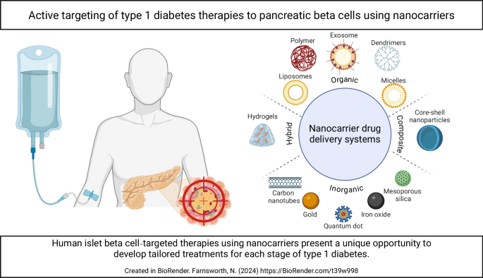
Targeted delivery to pancreatic β-cells
I studied extracellular-matrix effects on cell differentiation and insulin-secreting cell viability, and worked on targeted nanocapsule delivery and image analysis. I’m a coauthor of the 2024 research abstract on polycaprolactone nanocapsules for pancreatic β-cell survival.
My role: Type 1 Diabetes Researcher · August 2023–May 2024
I studied extracellular-matrix effects on cell differentiation and insulin-secreting cell viability, alongside targeted nanocapsules. These diagrams explain the two research directions.
01 / EXTRACELLULAR MATRIX
How a cell responds to its surroundings
The extracellular matrix provides a physical scaffold and molecular contacts. Explore the path from the environment outside a cell to changes in its state.
Swipe diagrams sideways to inspect their labels.
The extracellular matrix surrounds cells and offers physical and molecular cues. This sketch shows a generic scaffold; it does not assign a particular material or stiffness to my experiment.
Conceptual diagram, not a measured differentiation time course. The specific cell lineage and matrix formulation are not assigned here. The lab’s published research includes ECM-containing scaffolds for islet function and survival.
02 / TARGETED NANOCAPSULES
Follow a capsule to a β-cell
A polymer shell carries the cargo. A surface coating provides a molecular targeting cue. Follow one capsule from formulation to cell-associated delivery.
Illustrative animation · reported formulations
Encapsulate the cargo
The reported formulation encloses Cy5 tracer in a polycaprolactone (PCL) nanocapsule. Cy5 is the fluorescent tracer used to examine delivery; it is not the therapeutic peptide.
Motion, timing, sizes, and the intracellular release sequence are illustrative. The animation does not predict targeting efficiency, drug dose, or cell survival. The study measured targeting, uptake, and viability; this is not a resolved uptake mechanism.
The formulation and experiments described in the 2024 research abstract I coauthored with the Farnsworth Lab.
Cargo
Cy5, δV1-1, or TAT-conjugated δV1-1 was encapsulated in polycaprolactone using emulsification and solvent evaporation.
PCL + cargo → nanocapsules
HA–Exendin-4
One coating combined hyaluronic acid with the GLP-1 receptor agonist Exendin-4.
HA–Ex4 → β-cell-directed formulation
ENTPD3 antibody
The other coating targeted ENTPD3, a human β-cell marker. The abstract reports more than 70% delivery to insulin-positive β-cells for this formulation.
ENTPD3 antibody → insulin-positive β-cells
Experimental readouts
The study evaluated uptake and survival in isolated mouse and human islets, and targeting in NOD mice.